Seasonal Event Campaign
Designed for Roadrunners, a nightlife and social group that hosts recurring events for young adults, this flyer promotes the Halloween edition of their seasonal Rollerskate Party. As a recurring event, this piece contributes to an ongoing visual campaign that supports brand continuity and audience recognition.
Project Marketing Design | Social Media Flyer
Flyer Overview
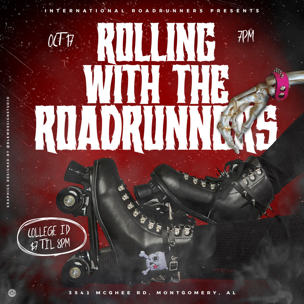
The design integrates Roadrunners’ signature red brand color, utilizing it not only to maintain identity but also to evoke a spooky, high-energy mood consistent with Halloween. A distressed dust texture, smoky overlay, and skull-themed skates enhance the eerie yet playful tone. The skates feature a custom purple skull with a red star-shaped eye socket, placed against a red-to-black ombré background that heightens visual impact and contrast.
To further reinforce the Halloween theme, the design swaps a standard arm for a skeletal limb, adding a chilly edge that complements the party vibe. The chosen typefaces balance fun and fright, using stylized, slightly distorted fonts that align with both seasonal aesthetics and brand personality.
This flyer serves as a key visual asset for promoting the event across digital and print channels, capturing the essence of youthful nightlife while embracing spooky seasonal flair.
Flyer Process Breakdown
This behind-the-scenes video captures the full design process of the Halloween Edition flyer for Roadrunners’ recurring skate party. From initial layout to final effects, the video showcases how spooky visuals, gritty textures, themed typography, and branded color choices came together to build a cohesive event identity. Every design decision — from the red star in the skull’s eye to the smoky textures and skeletal arm — helps reinforce the Halloween theme while staying aligned with the Roadrunners brand. This time-lapse highlights both the visual storytelling and the technical execution behind the finished flyer.