Cybercore
Magazine Spread
Project Overview
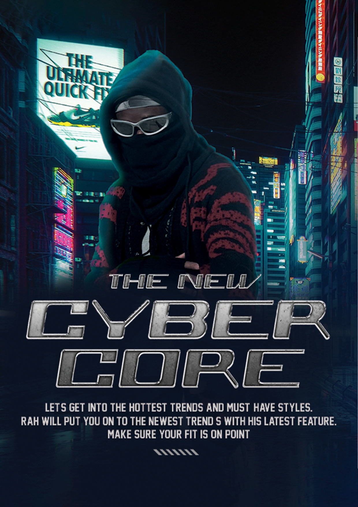
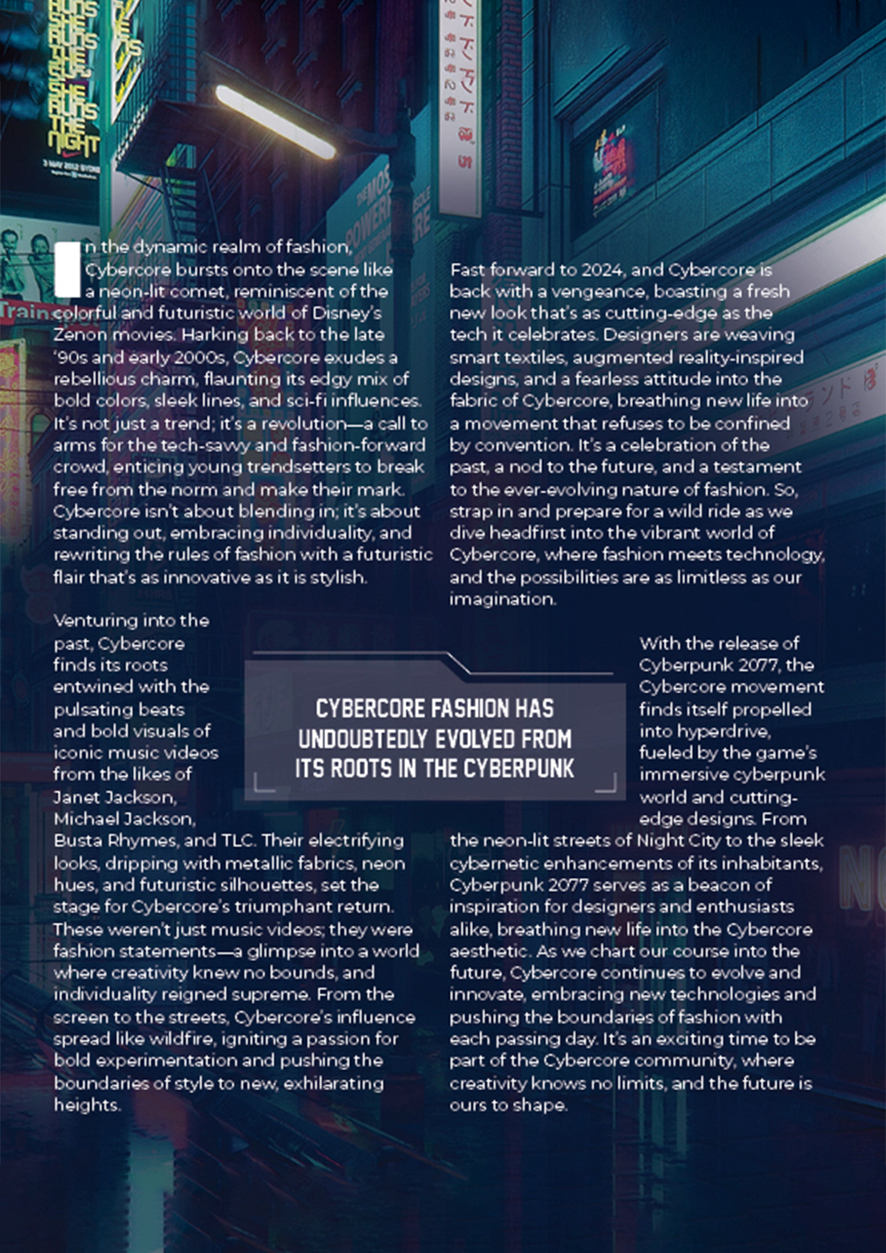
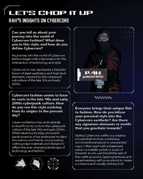
This project involved designing a four-page magazine spread that explores the CyberCore aesthetic through an in-depth, visually-driven interview with a participant deeply immersed in the culture. The spread balances written content with striking visuals to reflect the movement’s layered identity — blending nostalgic futurism, techwear fashion, and Y2K digital aesthetics.
Key Metrics/Quick Facts
Role: Editorial Designer
Platform: Print, Digital Editorial
Focus: Editorial Layout, Visual Storytelling, Typography
Tool: Adobe Creative Suite
Timeline: 3–4 Weeks
Project Goals
• Visually capture the style and ideology of the CyberCore subculture.
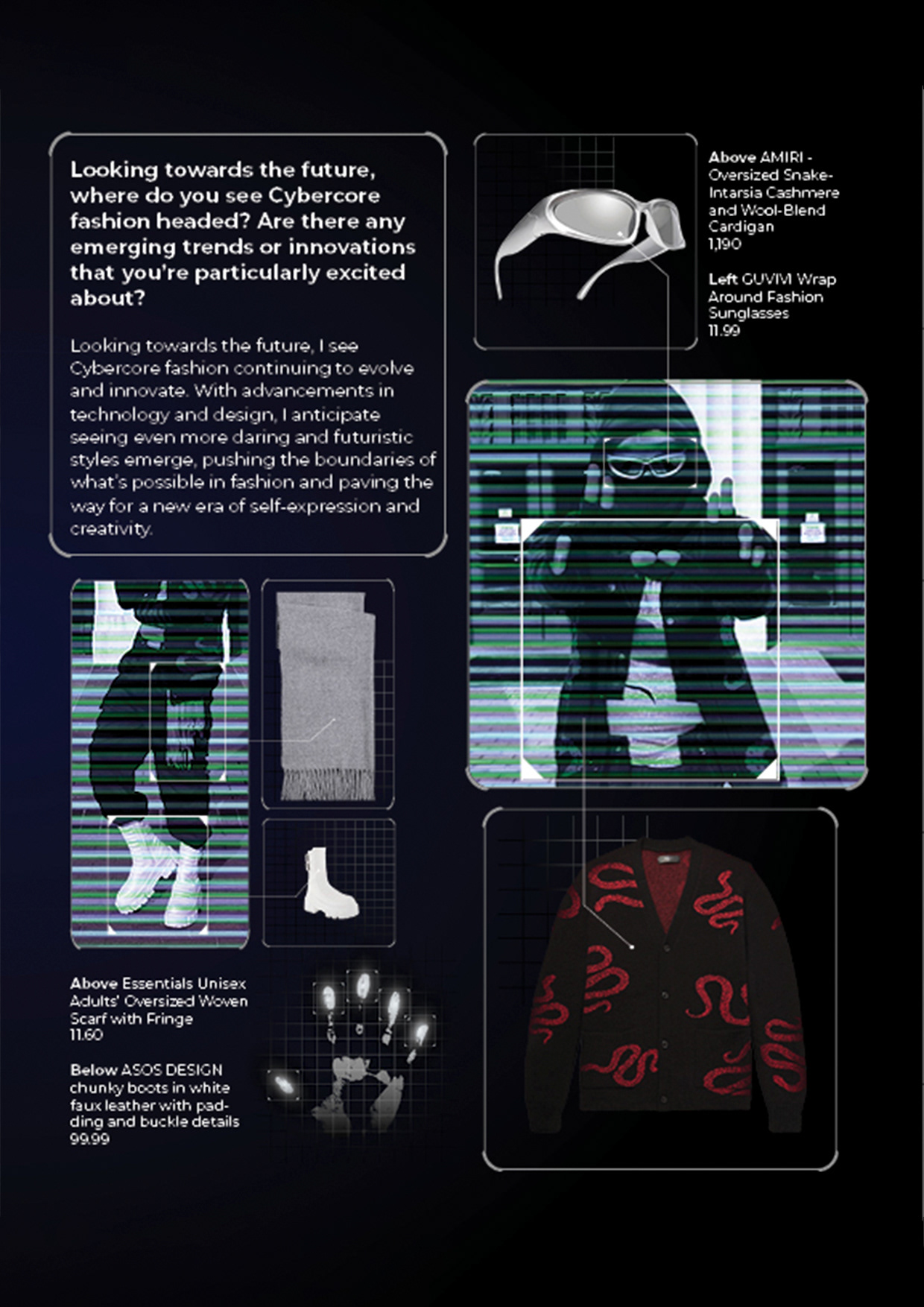
• Integrate original photography with curated product shots to contextualize featured fashion pieces.
• Use typography and layout inspired by early web interfaces and cyberpunk visuals to echo the subculture’s aesthetic roots.
• Create an immersive editorial experience that combines cultural storytelling with bold, futuristic design.
Process & Tasks
• Conducted original photoshoots with the interviewee styled in CyberCore fashion.
• Selected and sourced product imagery from online retailers for authenticity and context.
• Developed initial layout mockups focusing on content hierarchy, image-text balance, and visual flow.
• Iterated on designs by analyzing early drafts that lacked thematic impact, leading to a stronger emphasis on clothing imagery and dynamic visual pacing.
• Incorporated design cues from sci-fi interfaces—such as scan lines, data overlays, and glitch effects—to evoke Cyberpunk- inspired world-building and surveillance tech aesthetics.
• Applied Photoshop techniques to create specialized effects, including a ‘scan’ effect that mimics vintage security camera visuals, demonstrated in a supporting video tutorial.
While this version offered visual balance, I ultimately decided it didn’t support the theme of the article effectively. The original arrangement felt too static and lacked the visual impact needed to reflect the subject matter. I revised the layout to better emphasize the clothing imagery, enhance visual flow, and create a stronger connection between content and design.
Outcome
The final editorial spread uses a modular grid and high-contrast palettes layered with textures and digital artifacts to mirror the gritty, hyper-visual cyberpunk media landscape. The design successfully immerses readers in the CyberCore subculture’s dystopian futurism while maintaining readability and editorial flow. This project showcases the fusion of cultural narrative and experimental editorial design.
Technique Breakdown: 'Scan' Effect in Photoshop
A quick demonstration of how I created the ‘scan’ effect—replicating vintage security camera scan lines—using photo manipulation techniques in Photoshop, after a teammate asked about the process behind one of my images.
